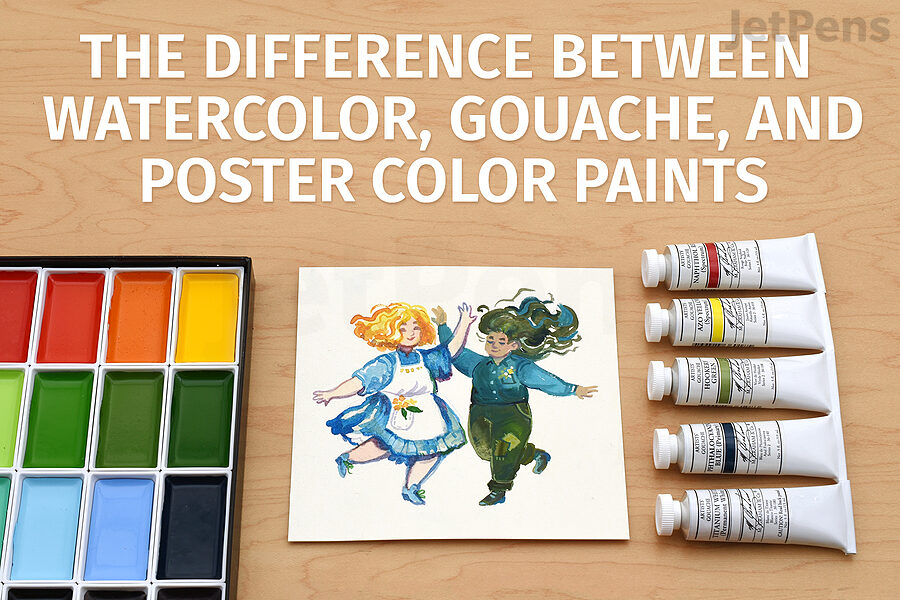
Watercolor, gouache, and poster color paints have a lot of similarities, but they’re not exactly the same. Watch the video below and keep reading for a detailed look at the differences between these versatile water-soluble paints.
What is the Difference between Watercolor and Gouache?
Watercolor is transparent and gouache is not. Otherwise, they’re pretty similar! We’ll sum up the differences here and get into detail below.
| Watercolor | Gouache |
- Transparent
- Finely-ground pigments
- Create light colors through preserving the white of the page
- Difficult to lift from page
- Dries lighter
- Looks delicate and ethereal
|
- Opaque
- Larger pigments
- Create light colors with opaque light paint
- Easy to lift from page
- Light colors dry darker, dark colors dry lighter
- Looks solid and crisp
|
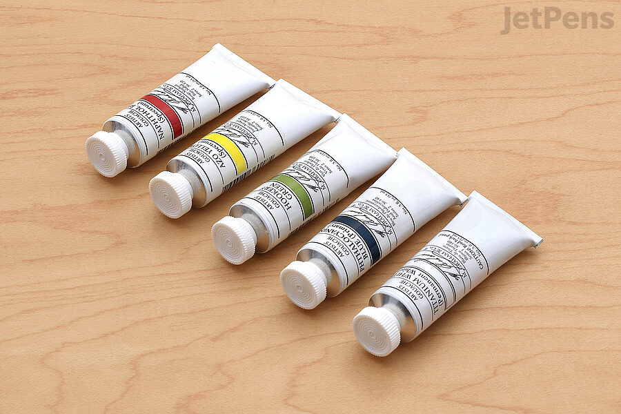
What Are the Ingredients in Water-Soluble Paint?
Pigments
Small pigment particles sink further into the paper.
Large pigment particles sit on top of the paper.
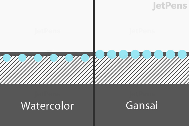
Watercolors, gouache, and poster colors all rely on pigments for their coloring rather than dyes. This means that tiny pieces of colored stone or other physical materials are suspended in the paint mixture, rather than being dissolved like dye.
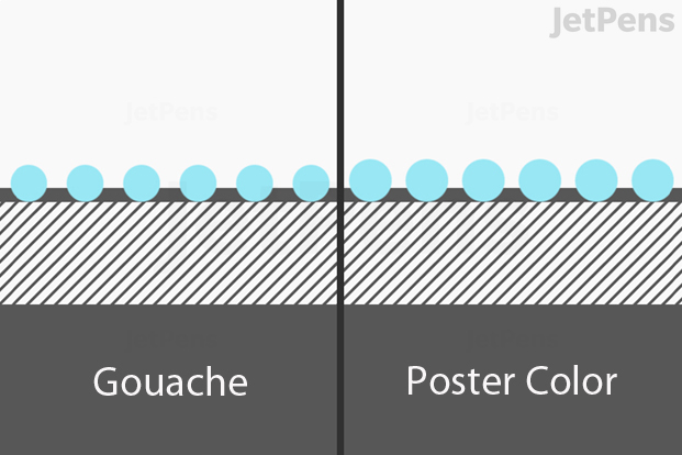
The most consistent difference between these paints is the size of their pigment particles. Western-style watercolor pigment particles are the smallest, gansai watercolor particles are slightly larger, gouache particles are bigger yet, and poster colors have the biggest particles.
Generally speaking, small pigment particles make paint that is more transparent and harder to lift from the paper. They are also less likely to form granulation effects. This is because the lightweight pigments spread more evenly over the paper. Bigger, heavier pigments tend to settle into the texture of the paper and may have visible darker spots or “grains” of color.
Some pigments contain toxic chemicals like cadmium and cobalt. However, in the paint-making process, these chemicals are coated in binder, rendering them insoluble in water. This greatly limits health risks. That said, they are still fat-soluble, so don't eat them! To be extra careful, you can also let paint water fully evaporate, then dispose of it into a trash can, instead of pouring it back down the pipes.
Binder
All paint uses a binder to hold the ingredients of the paint together. Many watercolors, gouache, and some poster colors use the dried sap of the acacia tree, known as gum arabic, as their binder. Gum arabic easily redissolves in water after it has dried, so it’s easy to reactivate paint made with it for blending and lifting.
Japanese gansai watercolors traditionally use animal glue as a binder, but many modern gansai paints use alternatives like beeswax and sugar. These binders can give gansai a glossier finish than Western watercolors, but they otherwise behave quite similarly.
Additives
Water-soluble paints also contain additives, which vary considerably between product lines and even between individual paints in the same line. Some common additives are humectants to keep the paint moist, preservatives to prevent mold, brighteners to make the paint more vibrant, and dispersants to help the pigment spread out in water.
Other additives “stretch” the paint so that it contains less pigment. This can make the paints less expensive or tone down intense pigments so that they are easier to use with other paints in the same product line.
Although some additives are necessary, they can have side effects. Paints with brighteners look more colorful in the pan and when wet, but they are typically more opaque and develop a faded or chalky appearance when dry. Paints with dispersants or large amounts of humectants can penetrate more deeply into the paper fibers and resist lifting. Not all manufacturers list what additives they use, but artist quality paints usually have more pigment relative to additives than student grade paints.
Paint Considerations
Transparency and Opacity
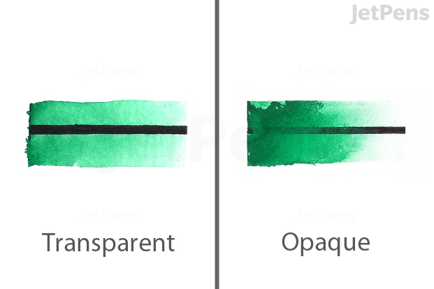
Transparent and opaque paints.
Opacity and transparency refer to how thoroughly a paint covers the color underneath it or allows it to show through. Broadly speaking, paints with smaller pigments are more transparent and paints with larger pigments are more opaque. This is because the same number of pigment particles in a unit of paint will be more spread out if the particles are small, leaving more space for the paper to show through. Larger particles take up more space, so they block more of the paper. Additives like brighteners and white pigments can also make paint more opaque.
Blendability
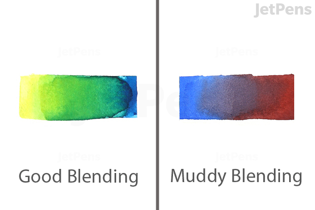
Good blending versus muddy blending.
All of these paints are easy to mix in a
palette or on paper. They can also reactivate with water for blending edges together. However, hues that are made with a mix of different pigments can get muddy when blended with other colors. Poster colors are often made with multiple pigments, but so are some watercolors and gouaches.
Be sure to test paints on a piece of scratch paper to see how well they blend if you’re not sure whether they’re made with single pigments or not. If they don’t blend well, use thicker layers of paint to reduce the chances of the underlying color reactivating and blending with the new color.
Another factor to keep in mind is color temperature: a “cold” or bluish yellow might be a pure pigment, but when mixed with red, it won’t make the vibrant orange that a “warm” yellow would. For a little more information on color mixing, check our guide to The Best Watercolor Supplies.
Lifting
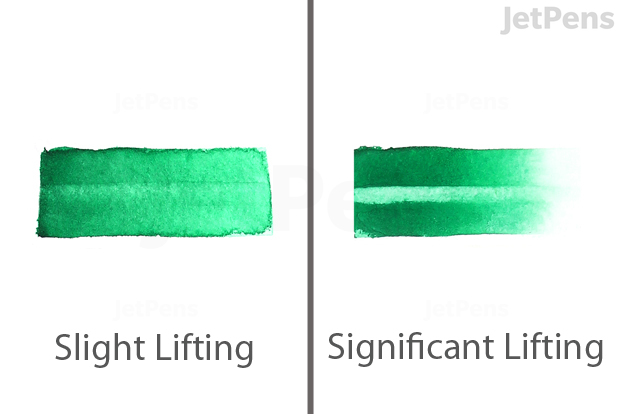
Slight lifting versus significant lifting.
Artists often lighten paint that is already on the paper by dabbing it with water and a dry brush. This technique is called “lifting.” If you’re not careful, it can sometimes happen accidentally!
Paints made with smaller pigments, like watercolors, tend to be harder to lift because the particles can nestle snugly between paper fibers. Larger particles don’t fit between paper fibers as well, so they are more likely to sit on the surface of the paper, making lifting easier.
Surface
Watercolors, gouache, and poster colors all work well with
watercolor paper, which is specifically designed to stand up to the amount of water used with these paints. Gansai watercolors are made for use with traditional Japanese
washi paper but can also be used on watercolor paper. Both gouache and poster colors are opaque enough to be used on
colored paper.
Metallic watercolors also look striking on contrasting paper.
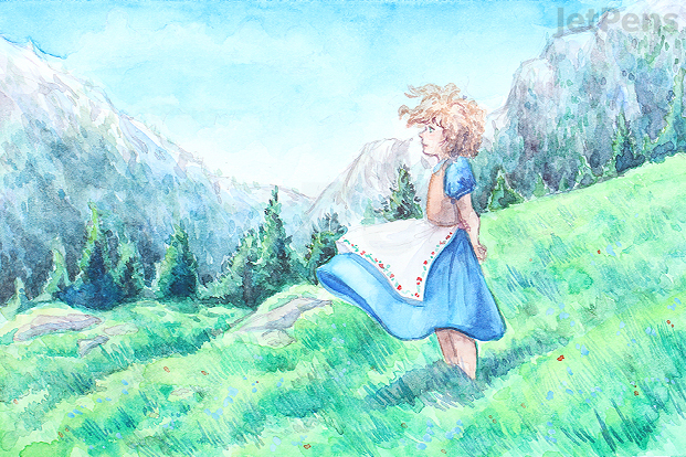
Watercolor paint is known for its transparency, which allows it to create delicate washes and nuanced, layered shading. Its transparency comes from the size of its finely ground pigments. The small particles spread evenly over the paper to make smooth washes and allow the color of the surface below to show between each particle.
Although the transparency of watercolor can result in beautifully luminous artwork, it also limits how these paints can be used. Light colors are not opaque enough to cover previous layers, so they must be applied before dark colors and then carefully avoided for the rest of the painting.
You may be able to lighten dark areas with lifting if you accidentally put down a dark color too early, but no guarantees! You can also cover areas that need to stay light with masking fluid to protect them from stray paint.
Be aware that watercolor tends to dry lighter than it looks when wet on the page. We recommend creating a swatch sheet of all of your paints, so you have visual references for how they dry. If you’re painting quickly, don’t be afraid to put down bold, bright colors.
Some watercolors are less transparent than others. Certain pigments, especially earth minerals like cadmium red and yellow ochre, naturally make more opaque paints. Other paints are made more opaque with additives. Both these and gouache are sometimes referred to as opaque watercolors, but gouache is made with larger pigments.
Gansai are traditional Japanese watercolor paints.
Gansai are slightly more opaque than Western watercolors.
Gansai are traditional Japanese watercolors. They are designed to be used in a single layer on absorbent washi paper rather than in multiple layers, but they can still be used that way. They are made with larger pigments than Western watercolors. This makes them both more opaque and easier to lift, as the larger pigments block more of the paper and don’t penetrate as far into the surface. They also tend to be made with more intense pigments for extra vibrancy. When used for washes, they often create interesting granulation effects with a textured or mottled look.
Gansai are not usually bound with gum arabic. The traditional binder is animal glue, but these days gansai can be made with beeswax, sugar, and other binders. This can give gansai a glossier finish than Western watercolors, especially in areas where they were applied heavily. Kuretake Gansai Tambi Watercolors are made with water-soluble resin. You can see swatches of the Kuretake Gansai Tambi paints in this video.
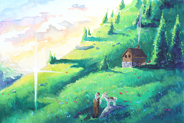
Gouache is made with intense concentrations of large pigments.
Gouache is mostly opaque and dries to a flat finish.
Gouache, pronounced goo-aash or gwash, is very similar to watercolor paint in its composition. However, it is designed to be opaque and to dry to a flat finish. It is made with intense concentrations of large pigments. Many gouaches use additives like chalk and titanium dioxide (known as titanium white when it is made into a paint) to make them more opaque. Others, like M. Graham Artists’ Gouache, do not. Avoiding additives means that some colors remain semi-transparent, but it also keeps them more pure. This allows artists to choose whether to mix colors with titanium white to achieve full opacity or work with them as is.
Gouache’s opacity gives you more freedom to paint on colored papers and add light colors over darker hues. Its flat finish makes it good for solid shapes that don’t show the pooling and gradation common to watercolors. Gouache can be diluted like watercolor paint if you don’t need its full opacity, but its washes aren’t quite as delicate. Gouache also lifts easily due to its larger pigments. If underlying colors reactivate and mix with layers you add over them, layer with thicker paint to reduce the chance of accidental lifting.
Unlike watercolor, light-colored gouache dries darker and dark gouache shades dry lighter. If you come to gouache from watercolor, the colors that dry darker will be much more noticeable and can even be frustrating. This behavior varies between brands. Be sure to mix a lot of paint if you need to cover a large area in a flat color, and be sure to keep practicing; as you learn the paint’s behavior, adjusting for it will become second nature.
In addition to being used on its own, gouache is easy to use with watercolor paints. You can use it to add light-colored highlights over dark paint (though it has a more solid feel than the delicacy of negative space in watercolor) or even mix white gouache with watercolor paint to make the watercolor more opaque and vibrant.
Though JetPens does not offer them, acryla gouache paints are a large part of the gouache market. Acryla gouache is not a water-based paint. Like its name implies, it is made with an acrylic binder. It cannot be reactivated by water (whether on the page or in an accidentally dried-out tube) and will not allow you to layer watercolors over it. If you see “acryla” on a tube, keep in mind it will behave quite differently than traditional gouache.
Unlike watercolor and gouache, poster color does not refer to a specific kind of paint. Instead, it is a general term for opaque water-soluble paints meant for scanning and reproduction rather than display. Poster colors are usually less expensive than paints intended for display, and not very lightfast. Their opacity comes from additives and coarsely-ground pigments. They also lift very easily. It’s a good idea to test any new paint so you know how it will behave before you use it in your art, but we especially recommend testing poster colors because they can be made with a wide variety of different binders.
Poster colors are highly opaque. Like gouache, they work well on both white and toned paper. You can easily add light colors over dark hues, so they are wonderfully straightforward to paint with. They are also very vibrant. Some colors are made with multiple pigments and can form muddy hues when mixed, so it’s best to start with large blocks of thin color and add details on top with thicker paint. This prevents the previous layers from reactivating and mixing with the new paint. Stick to just a few layers to reduce the chance of the layers blending, as demonstrated in our Nicker Poster Colours video.
Nicker Poster Colours are known for their use by Studio Ghibli and other Japanese animation studios, who use them to paint backgrounds. They’re different from typical poster colors in that they are made with gum arabic, like most gouache and watercolor. Nicker also lists the paints’ lightfastness, opacity, pigment codes, and tendency to bleed into colors layered over them, so you can select only the colors with the properties you need.
Test Results
We tested representatives from each paint category to see how they compared in terms of transparency, blending, lifting, layering, and when thinned to a wash. Bear in mind that these are only broad comparisons. In addition to varying by paint type, all of these characteristics vary considerably between brands, product lines, and even different colors within the same product line.
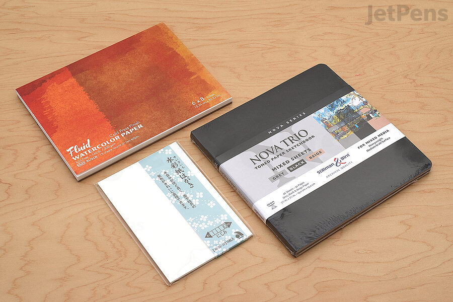
Paints also behave differently on different paper. We performed our tests on Global Art Fluid Watercolor Paper and used similar colors across these tests to keep them as comparable as possible. You can see the product lines and colors used for each test below.
Gradient
This test demonstrates how each paint looks when used at full opacity and when thinned to a wash, with nothing else beneath it. Washes should be almost as thin and translucent as glass, so they work best with paints made with small pigment particles. This allows them to spread evenly and maximize their transparency.
Washes can be made with more opaque paints like gouache, especially if they are made without opacifying additives, but the effect is less delicate. The larger pigment particles can look grainy when thinned out. Poster colors are less suitable for washes because they are more likely to get muddy when other colors are layered over them.
| Test | Standard Watercolor | Gansai Watercolor | Gouache | Poster Colors |
|---|
| Gradient |  |  |  |  |
CONCLUSION
Watercolors, gouache, and poster colors have a lot of similarities, but each has its own unique character. Which paint is your favorite? Let us know in the comments below!